Paul Kremer — Paul Kremer / Nine Windows


Paul Kremer — Paul Kremer / Nine Windows
SOLD OUT
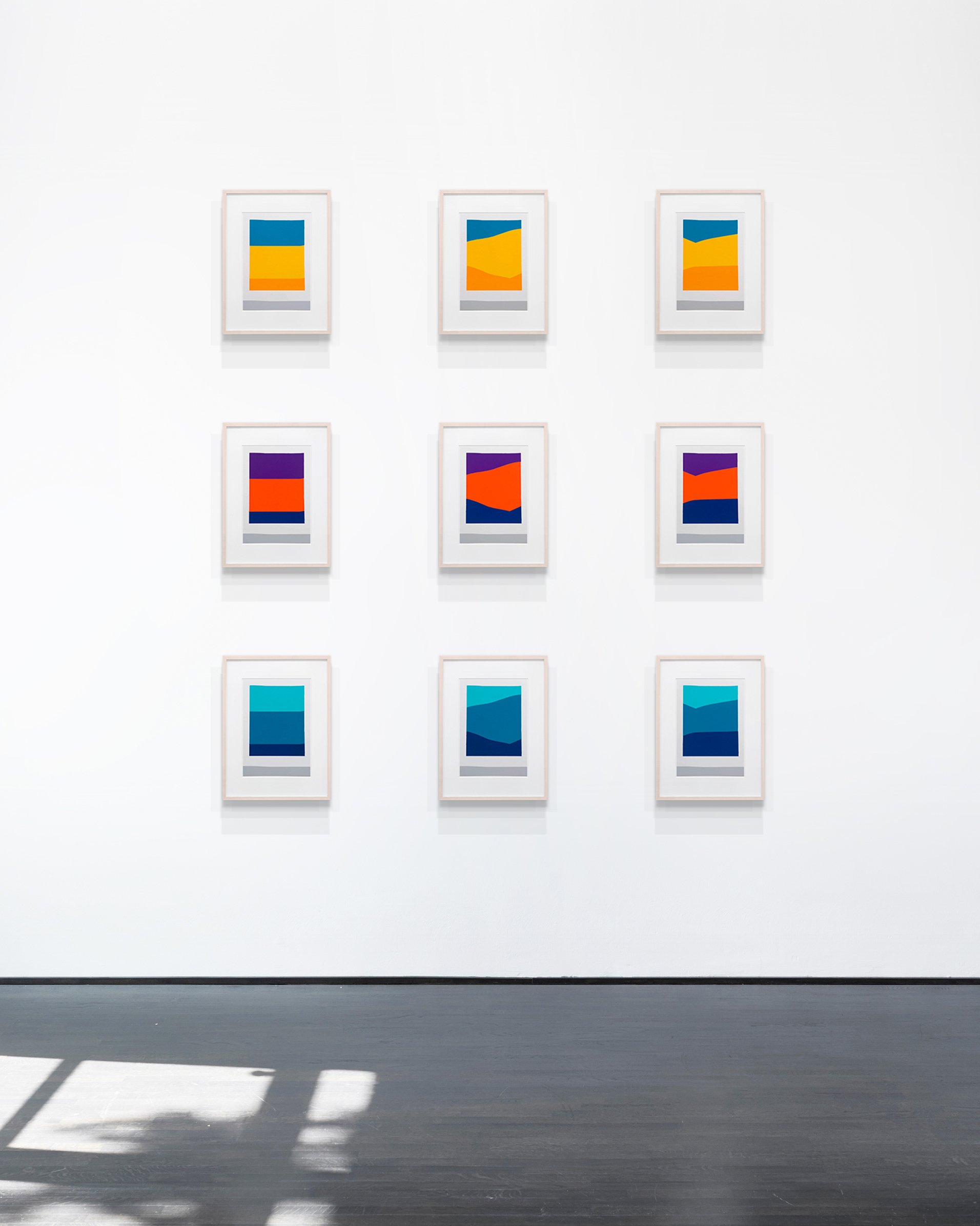
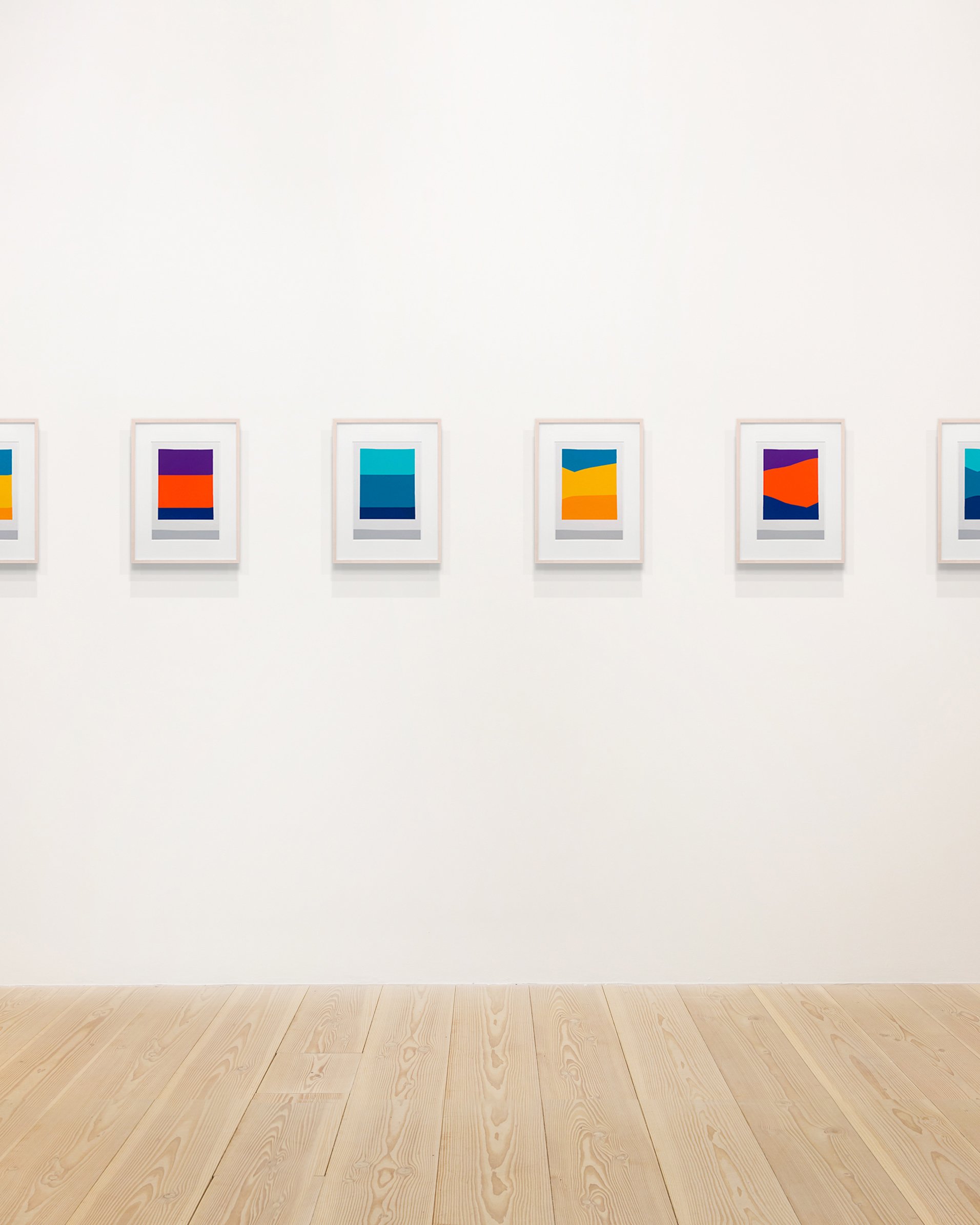
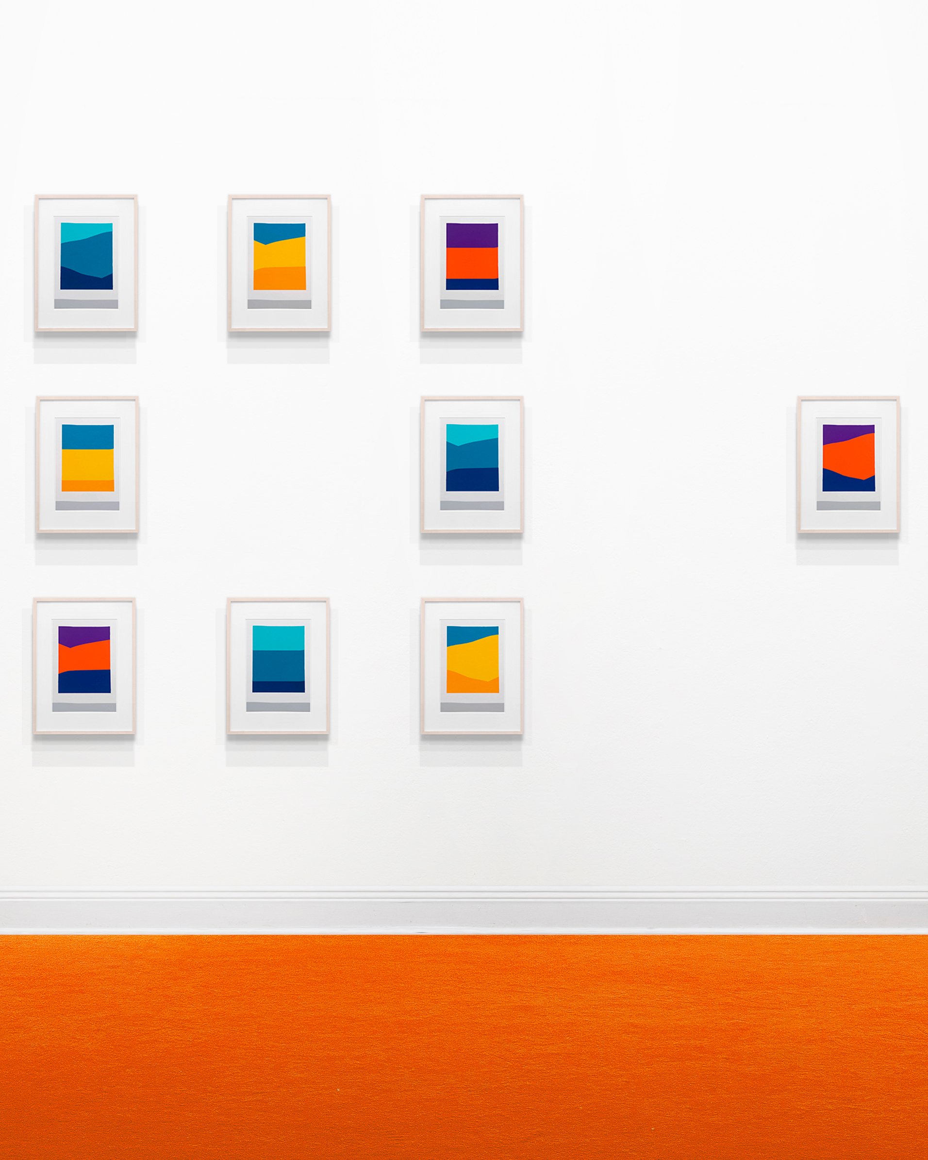
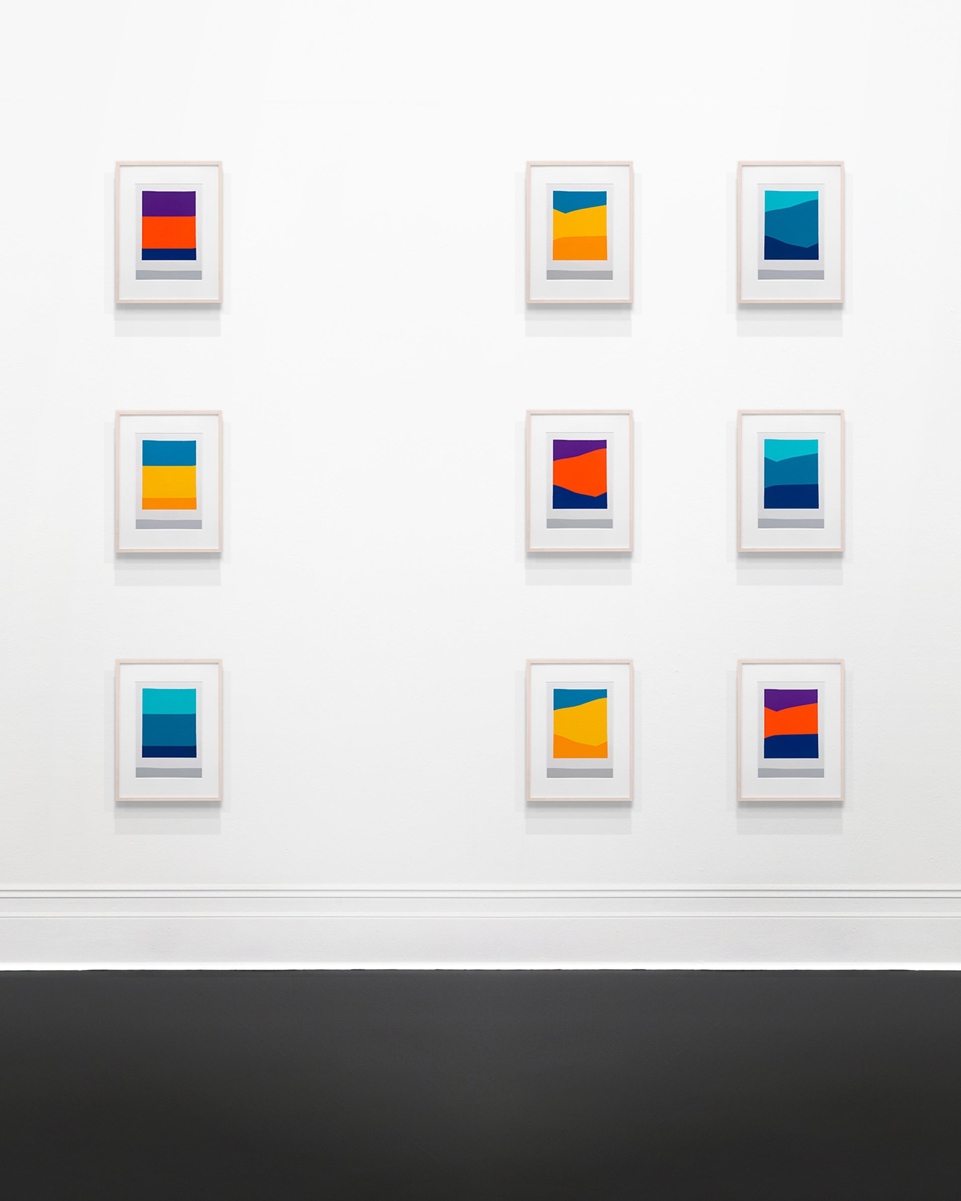
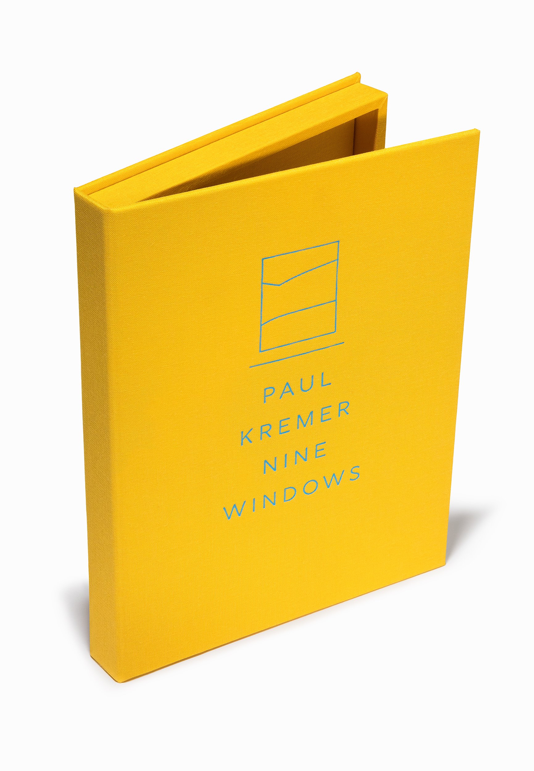
9 prints; 4 color hand-pulled screenprints on Mohawk 160lb super fine paper in a custom linen box with a signed colophon page on archival vellum. Handling gloves included. Each print is numbered and first print signed by the artist.
Prints: 9h x 6.5w inches each
Portfolio Box: 10.5h x 7.5w inches
Edition of 30
PLEASE NOTE
Limit one portfolio per person. Orders will ship within 2-4 weeks.
The buyer accepts all terms of sale and agrees that the edition will not be resold for a minimum of two years from the purchase date. The no-resale agreement is valid for the entire term specified regardless if a work was transferred or gifted to another Buyer.
Copyright of the artwork is non-transferable and remains the property of the artist.
Details
Louis Buhl & Co. is pleased to present Paul Kremer / Nine Windows, a new suite of prints by Paul Kremer following along his “Window Paintings” series. Paul Kremer / Nine Windows is composed of nine prints presented in a custom linen box with a signed colophon page on archival vellum. All portfolios include prints with matching numbers.
Windows have been painted throughout history—Kremer cites Lois Dodd, Vilhelm Hammershoi, and Pierre Bonnard as some of his favorite artists in this regard. In this style of work, Kremer layers flat fields of color to create an abstracted and simplified depiction of a window situated within a bare room. Rather than interpreting the scene as just that, Kremer invites his audience to perceive the window as a painting hanging on the wall, the minimalist view characterized by the organic landforms outside existing independently as a work of art in and of itself. Says Kremer: “Windows are especially interesting when you don't look at them as windows, but instead, a picture created within the window frame.”
Exemplified in Paul Kremer / Nine Windows, Kremer’s ability to imagine countless compositions using the same assortment of primary colors and stylistic components is impressive. Graphic applications of color define the works’ inherent flatness; however, an illusion of depth is simultaneously projected onto the viewer, introducing a dichotomy that is uniquely synergetic. The forms within the pieces are abstract, but not to the point where representation is entirely neglected. In addition to the digestible yet bold configurations, the works’ titles give cues to their inspiration and insight into their real-life allusion. This combination of factors allows for the viewer to easily interpret the scene and further understand it through their own knowledge of the subject and its material existence, resulting in an enjoyable connection to the abstraction’s referential qualities.